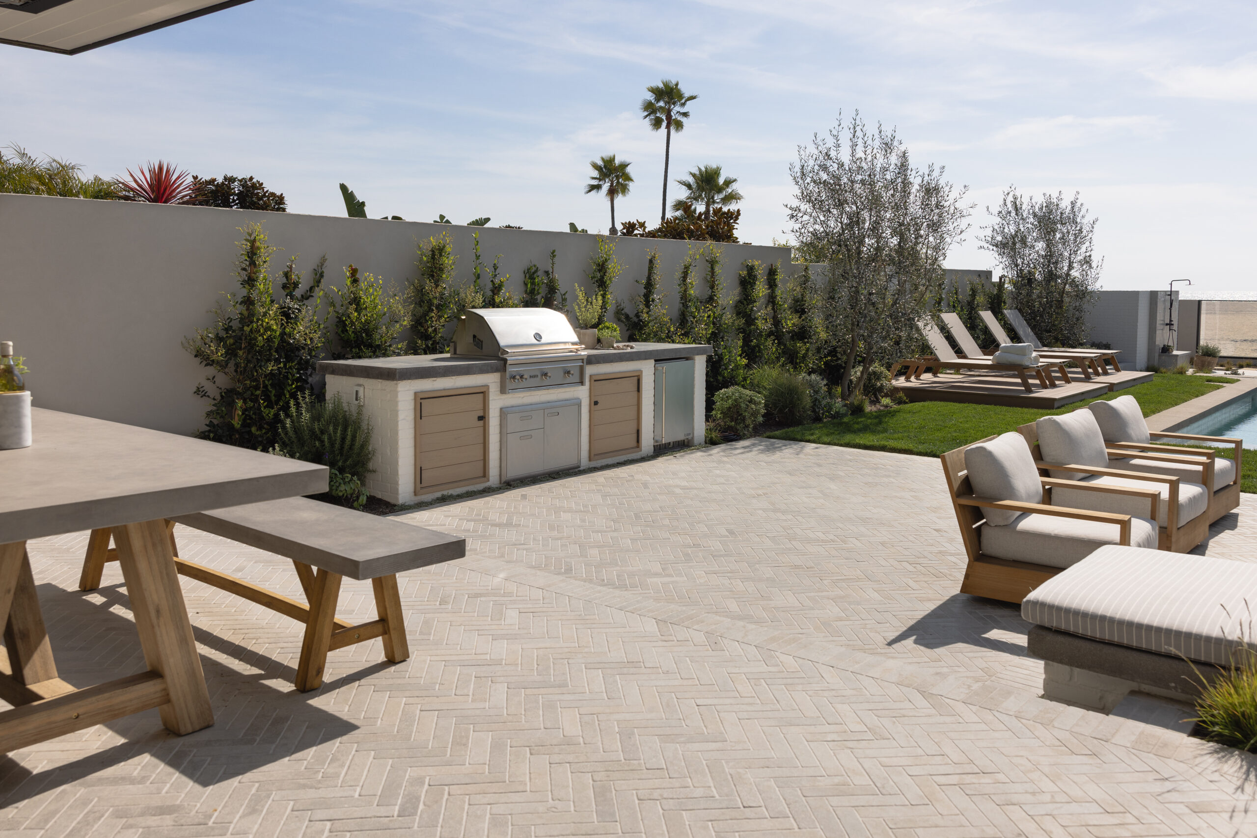
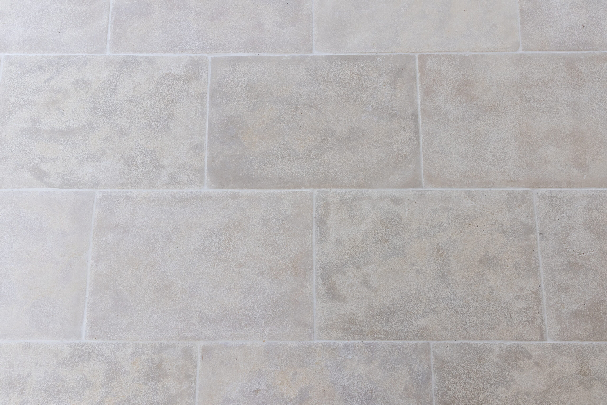
Picking the right color for your home’s exterior can feel a bit overwhelming, but it doesn’t have to be! Here at Garden Studio Design, we’ve dedicated years to perfecting our craft, and we’re excited to share our favorite hues with you. From bright creamy whites that light up your facade to deep charcoal grays that bring a touch of drama, these colors not only work beautifully together but also pop against lush greenery. It’s no surprise this is one of our most frequently asked questions! So let’s dive into our top picks and see how they can transform your home’s curb appeal.
1.Creamy Whites & Warm Beiges
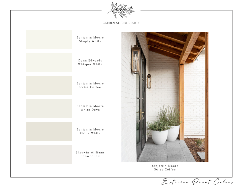
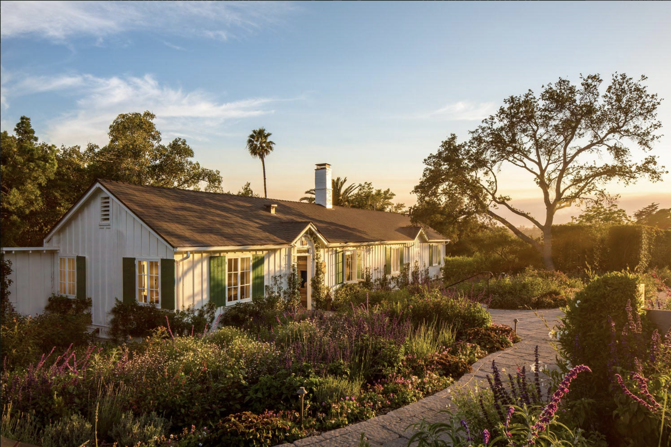
When it comes to timeless exteriors, creamy whites and warm beiges are hard to beat. These shades infuse your home with elegance and warmth. Our curated selection features soft, inviting hues that provide a versatile backdrop, letting your architectural details shine through while creating a welcoming vibe. Their warm undertones blend seamlessly with the surrounding greenery, making them a fantastic choice for any style—from modern and sleek to coastal traditional. Whether you’re dreaming of a chic contemporary look or a cozy beachside retreat, these colors adapt beautifully to enhance your home’s charm.
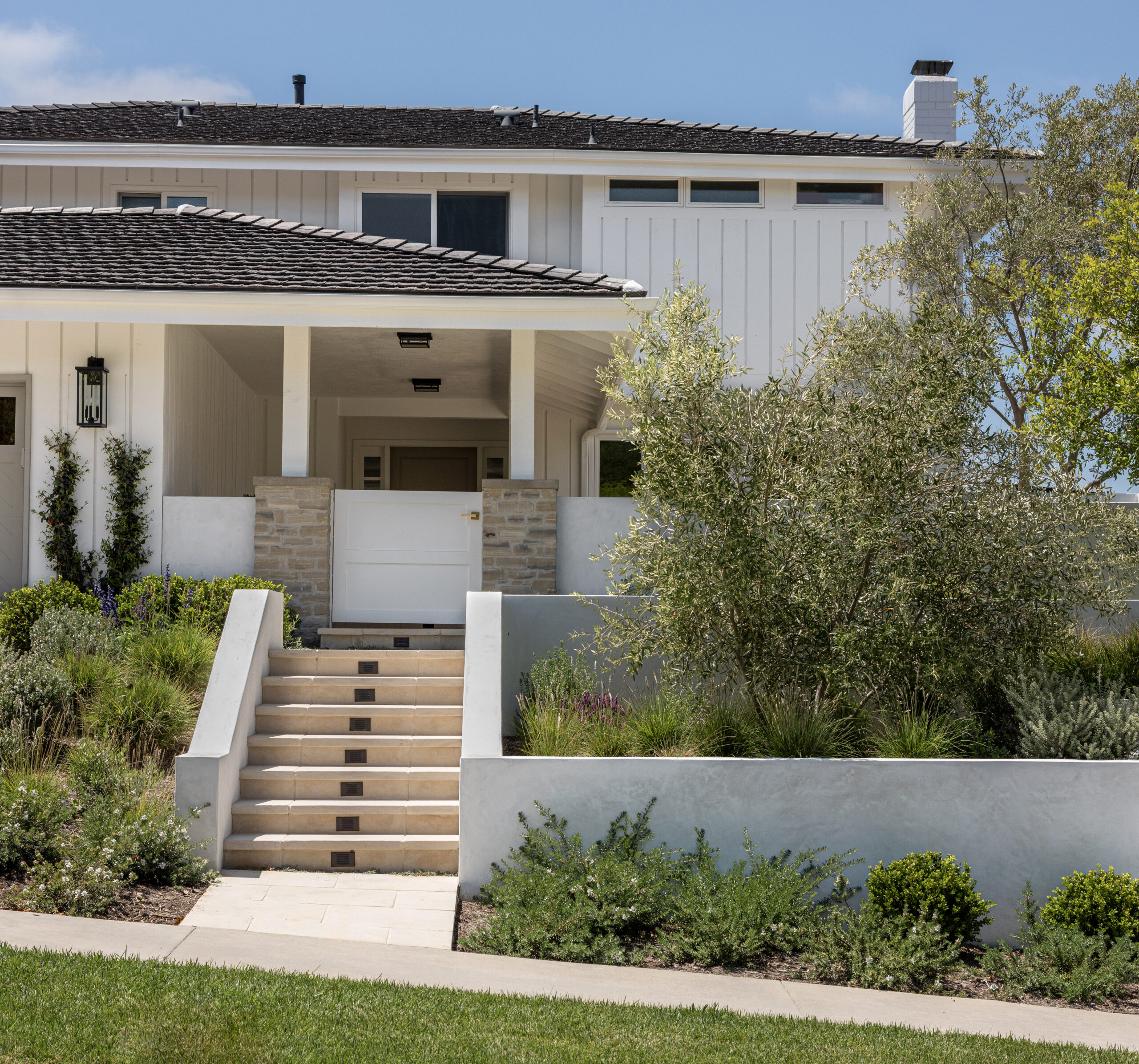
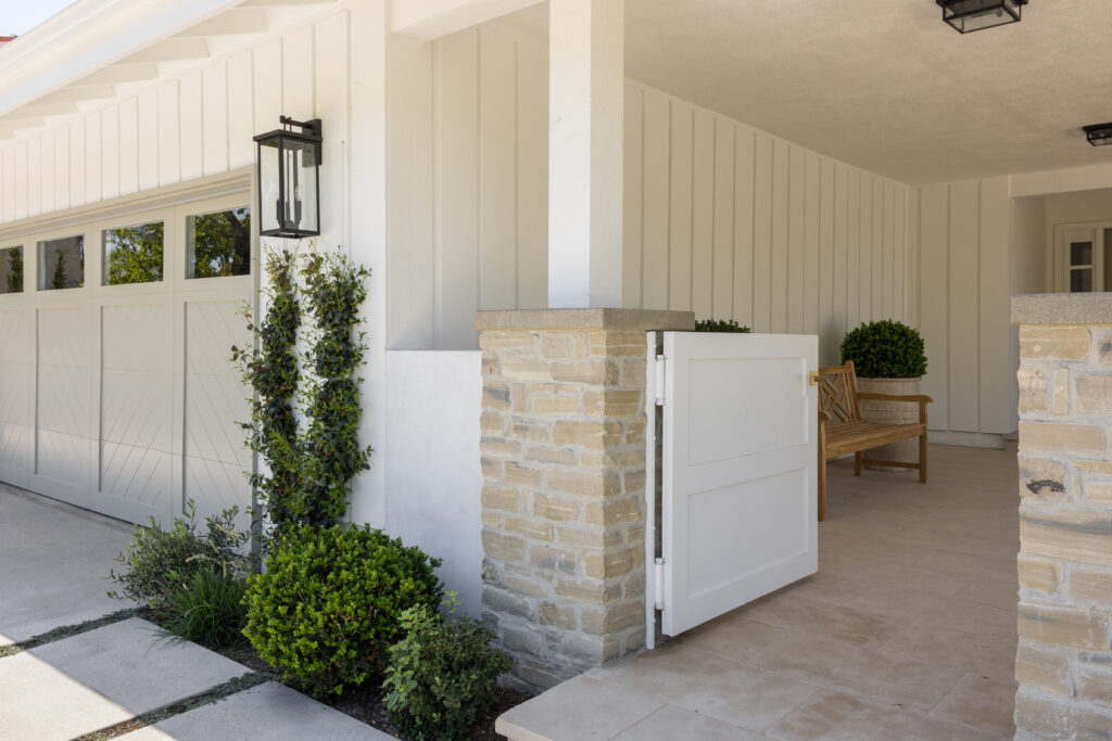
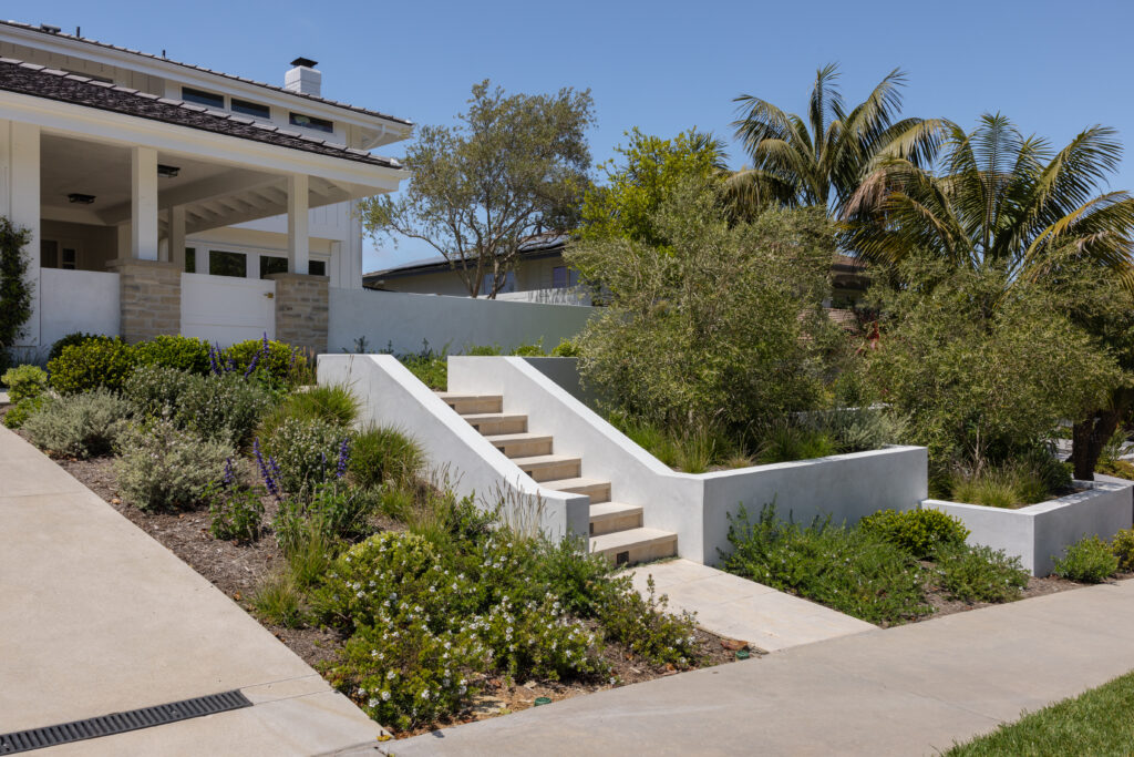
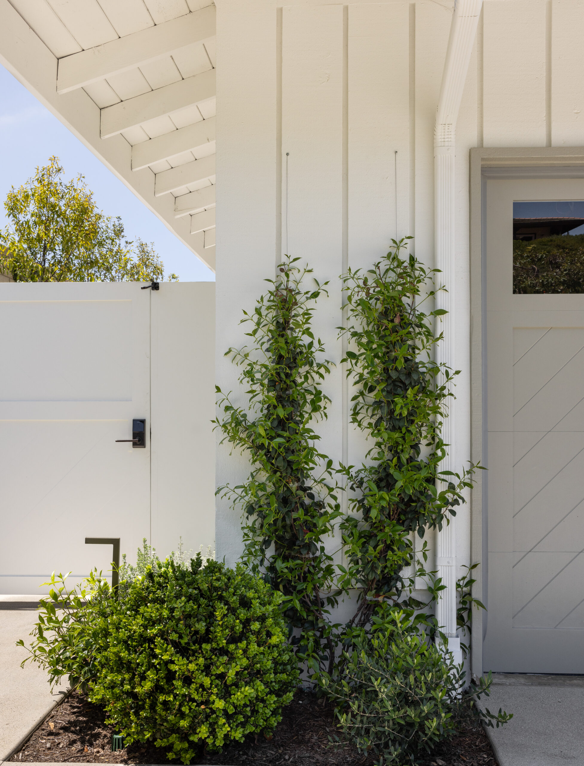
Pictured: Our Blue Coast Project, featuring an exterior paint in the color “Chantille Lace” by Benjamine Moore
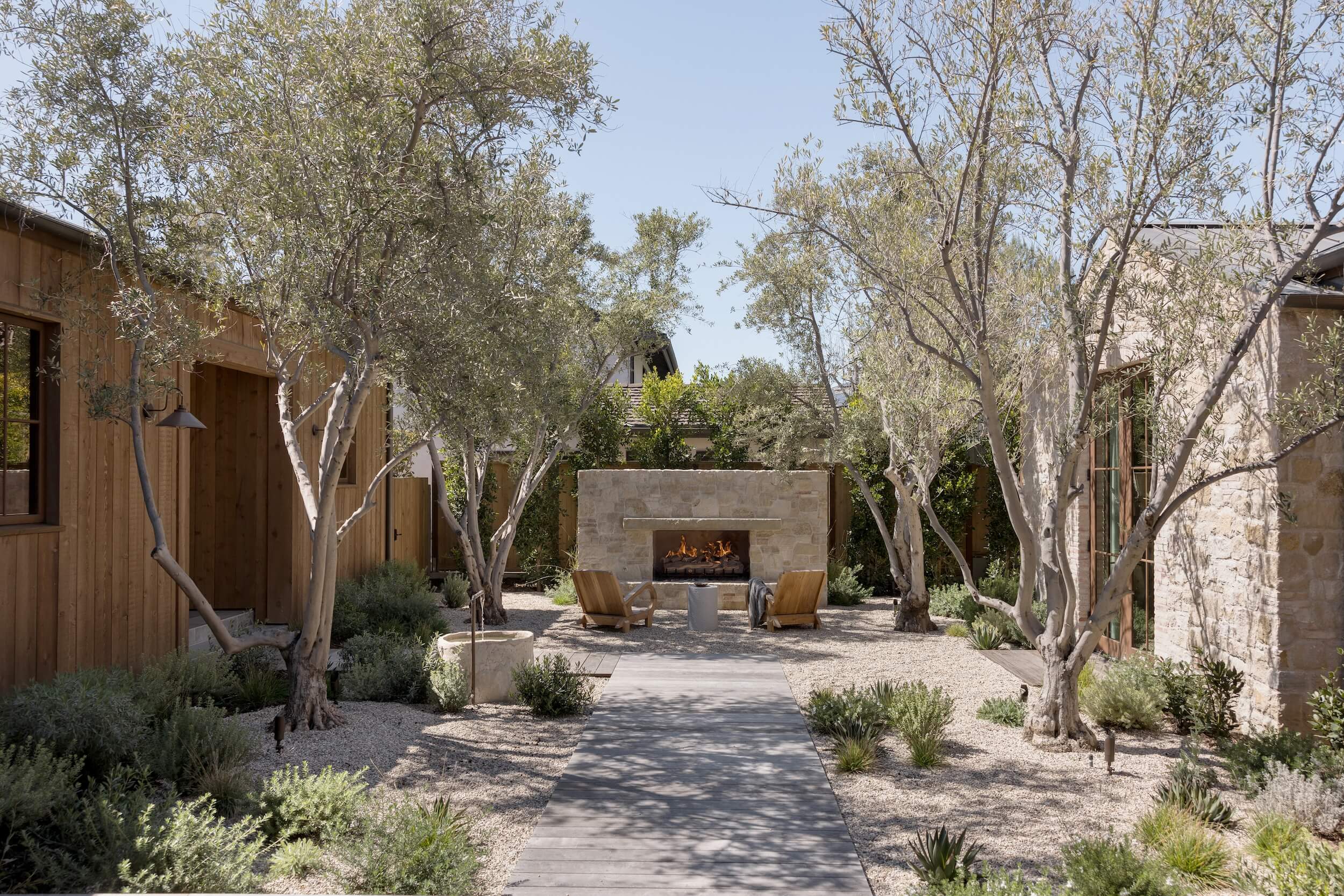
Plus, they look stunning alongside natural materials like slurried stone (think Lompoc or limestone) and rich, warm wood accents. We made sure our favorite colors deliver on two key points—versatility and beauty. You can go all-in with these soothing shades for your entire facade, or use them to accent decorative trim—the options are endless! Each color choice not only elevates your home’s visual appeal but also wraps you and your guests in a comforting embrace.
3. Soft Grays & Deep Charcoal
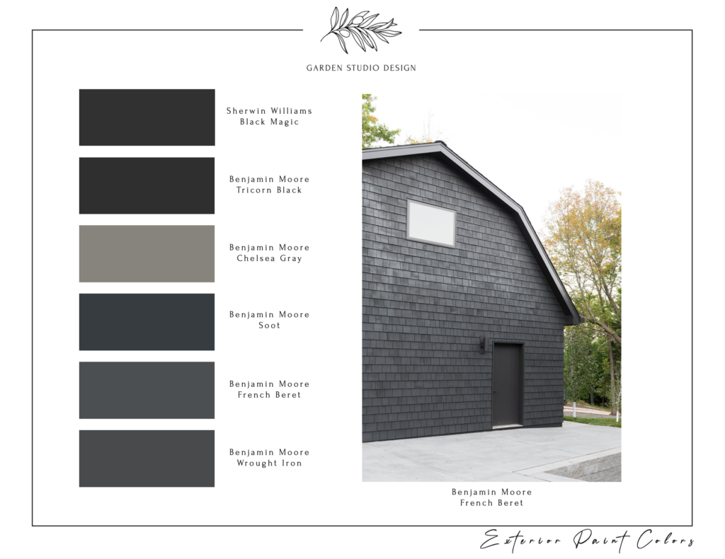
On the flip side, soft grays and deep charcoal grays add a sophisticated touch to your home’s exterior, blending modern style with timeless charm. Soft grays create a calm canvas that beautifully showcases vibrant landscaping, allowing your architecture to take center stage. Imagine a gentle gray hue reflecting the dappled sunlight through your garden—so inviting!
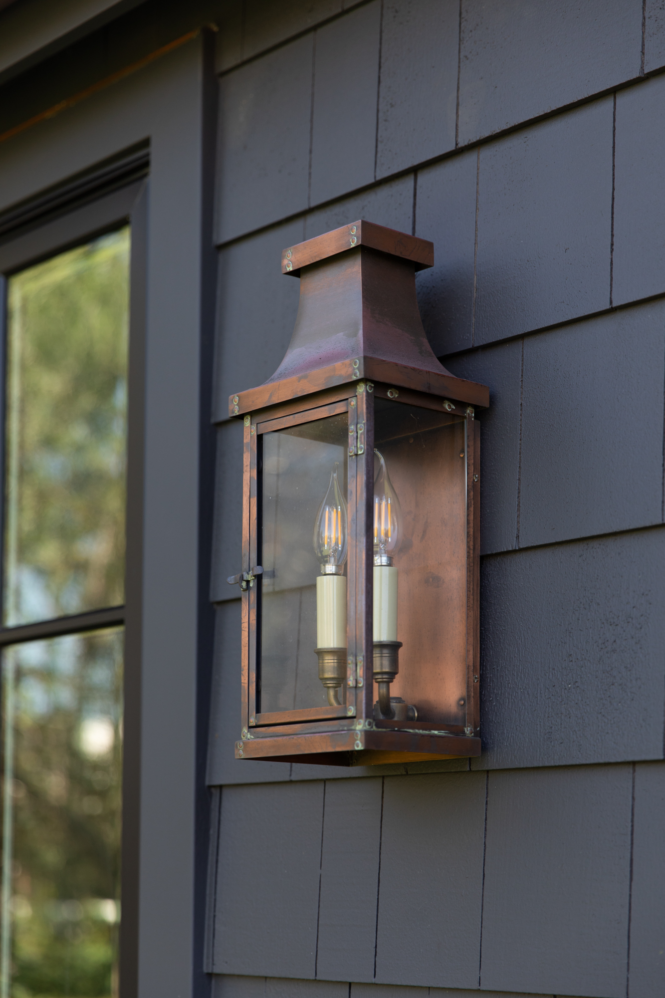
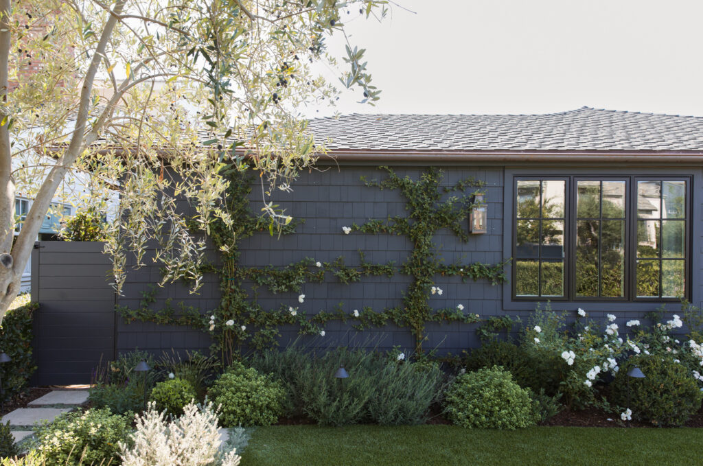
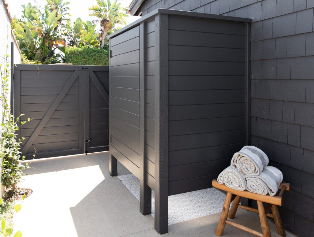
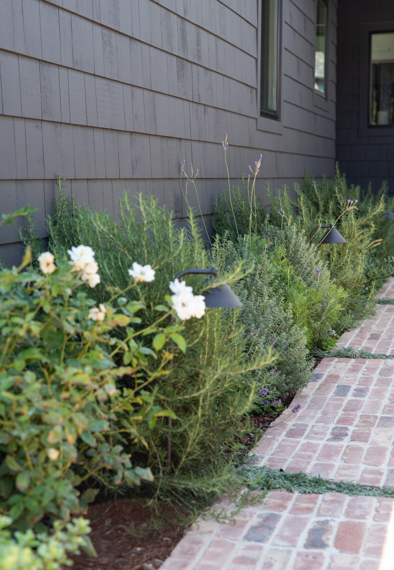
Pictured: Our Midnight Manor Project, featuring an exterior paint color in “Wrought Iron” by Benjamin Moore
Deep charcoal grays, however, make a bold statement, introducing depth and drama to your design. Together, these shades create a captivating play of light and shadow, ensuring your home stands out while still feeling elegantly understated. Whether you choose soft gray as your main color or save deep charcoal for accent details, this combination promises to leave a lasting impression.
In Conclusion…
These shades aren’t just favorites; they’re a thoughtfully curated palette we love recommending to our clients. Each hue contrasts beautifully with layered greens and fits seamlessly into various architectural styles. Whether you’re ready to paint your whole home or simply want to add a splash of color to your front door, these neutral tones offer endless possibilities.
At Garden Studio Design, we’re passionate about helping you navigate the world of exterior colors and find the perfect shades that resonate with your unique vision. We hope this guide inspires you to explore these timeless hues as you enhance your home’s exterior. Remember, the right color does more than beautify your space—it tells your story. Let’s make it a beautiful one together!
